

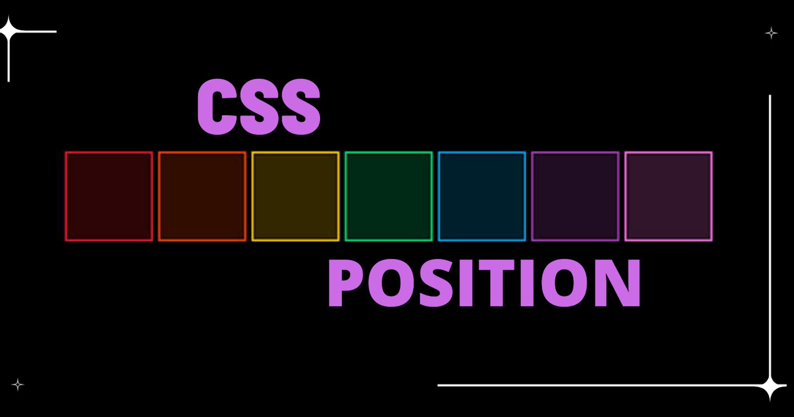
Learn CSS Position from Zero to Hero
Types of positioning method for a element are static, absolute, relative, fixed and sticky. Let's get started...


Understanding the positioning concept
Imagine a web page have elements and you just coded it without having thoughts on actual placement so all the element takes their own position automatically according to its layout defined. If you want to arrange each element to render as per UX/UI design then need to assign specific position.
Types of position properties
There are five type of position properties :
- Static
- Absolute
- Relative
- Fixed
- Sticky
So now we will talk about each and every position properties...
Static
It is the default position of HTML elements.
<!DOCTYPE html>
<html lang="en">
<head>
    <meta charset="UTF-8">
    <meta name="viewport" content="width=device-width, initial-scale=1.0">
    <title>CSS Position Tutorial</title>
    <style>
        .box{
            border: 4px solid yellow;
            padding: 6px;
            display: inline-block;
            width: 150px;
            height: 150px;
            margin: 2px;
        }
    </style>
</head>
<body>
<div class="container">
    <div class="box" id="box1">Box-1</div>
    <div class="box" id="box2">Box-2</div>
    <div class="box" id="box3">Box-3</div>
    <div class="box" id="box4">Box-4</div>
</div>
</body>

</html>
Absolute
An element with the absolute position will move according to the position of its parent element. In the absence of any parent element, the HTML element will be placed relative to the page. Now, we have changed the position of box3 from relative to absolute.
<!DOCTYPE html>
<html lang="en">
<head>
    <meta charset="UTF-8">
    <meta name="viewport" content="width=device-width, initial-scale=1.0">
    <title>CSS Position Tutorial</title>
 <style>
       .box{
            border: 8px solid yellow;
            padding: 6px;
            display: inline-block;
            text-align:center;
            color:#ffffff;
            background-color: gray;
            width: 150px;
            height: 150px;
            margin: 2px;
        }
        #box3 {
            position: absolute;
            top: 34px;
            left: 34px;
            }
        .container{
            border: 2px solid black;
            background-color: khaki;
            height: 3444px;
        }
    </style>

</head>
<body>
<div class="container">
    <div class="box" id="box1">Box-1</div>
    <div class="box" id="box2">Box-2</div>
    <div class="box" id="box3">Box-3</div>
    <div class="box" id="box4">Box-4</div>
</div>
</body>

</html>
Relative
It is used when we need to position an HTML element relative to its normal position. We can set the top, right, bottom, and left properties that will cause the element to adjust away from the normal position.
<!DOCTYPE html>
<html lang="en">
<head>
    <meta charset="UTF-8">
    <meta name="viewport" content="width=device-width, initial-scale=1.0">
    <title>CSS Position Tutorial</title>
 <style>
  .box{
             border: 8px solid yellow;
             padding: 6px;
             display: inline-block;
             text-align:center;
             color:#ffffff;
             background-color: gray;
             width: 150px;
             height: 150px;
             margin: 2px;
        }
        #box3 {
            position: relative;
            top: 34px;
            left: 34px;
 }
</style>
</head>
<body>
<div class="container">
    <div class="box" id="box1">Box-1</div>
    <div class="box" id="box2">Box-2</div>
    <div class="box" id="box3">Box-3</div>
    <div class="box" id="box4">Box-4</div>
</div>
</body>
</html>
Fixed
An element with position:fixed; will remain stuck to a specific position even after the page is scrolled. This position property is used when we want to keep an HTML element at a fixed spot no matter where on the page the user is.
<!DOCTYPE html>
<html lang="en">
<head>
    <meta charset="UTF-8">
    <meta name="viewport" content="width=device-width, initial-scale=1.0">
    <title>Fixed Position In CSS</title>
    <style>
        .box{
            border: 8px solid yellow;
            padding: 6px;
            display: inline-block;
            text-align:center;
            color:#ffffff;
            background-color: gray;
            width: 150px;
            height: 150px;
            margin: 2px;
        }
        #box3{
            position: fixed;
            right: 4px;
        }
    </style>
</head>
<body>
    <div class="box" id="box1"></div>
    <div class="box" id="box2"></div>
    <div class="box" id="box3"></div>
    <div class="box" id="box4"></div>
</body>
</html>
Sticky
It is a hybrid of relative and fixed position. An HTML element with position:sticky; will just sit there until a given position offset is met.
 <!DOCTYPE html>
<html lang="en">
<head>
    <meta charset="UTF-8">
    <meta name="viewport" content="width=device-width, initial-scale=1.0">
    <title>CSS Position Tutorial</title>

  <style>
       .box{
             border: 8px solid yellow;
             padding: 6px;
             display: inline-block;
             text-align:center;
             color:#ffffff;
             background-color: gray;
            width: 150px;
            height: 150px;
            margin: 2px;
        }
        #box3 {
            position: sticky;
            top: 3px;
            }
        .container{
            border: 2px solid black;
            background-color: khaki;
            height: 3444px;
        }
    </style>
</head>
  <body>
      <div class="container">
    <div class="box" id="box1">Box-1</div>
    <div class="box" id="box2">Box-2</div>
    <div class="box" id="box3">Box-3</div>
    <div class="box" id="box4">Box-4</div>
      </div>
  </body>

</html>