CSS Flexbox Properties

What is CSS Flexbox?
CSS flexbox is a one-dimensional layout pattern that makes it easy to design flexible and effective layouts. The use of flexbox ensures that elements are properly placed and are predictable.
CSS Flex Container
It is used to setting the display property to flex. The flex container properties are:
- flex-direction
- flex-wrap
- flex-flow
- justify-content
- align-items
- align-content
Flex-direction
It is used to fix the direction of the flex items inside the flex container.
<!DOCTYPE html>
<html>
<head>
<style>
.flex-container {
  display: flex;
  flex-direction: column;
}

.flex-container > div {
  background-color: #f1f1f1;
  width: 100px;
  margin: 10px;
  text-align: center;
  line-height: 75px;
  font-size: 30px;
}
</style>
</head>
<body>
       <h1>The flex-direction Property</h1>
       <p>The flex-direction is row is default value</p>

<div class="flex-container">
  <div>1</div>
  <div>2</div>
  <div>3</div>
</div>

</body>
</html>
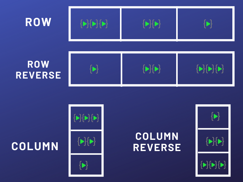
Flex- direction-row The row value stacks the flex items horizontally (from left to right).
Flex- direction-row-reverse The row-reverse value stacks the flex items horizontally (but from right to left).
Flex- direction-column The column value stacks the flex items vertically (from top to bottom).
Flex- direction-column-reverse The column-reverse value stacks the flex items vertically (but from bottom to top).
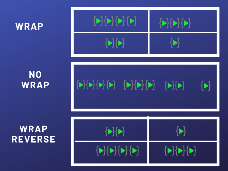
flex-wrap:
- Wrap: This property helps you set the number of flex-items you want in a line or row.
- No wrap: The no wrap value specifies that the flex items will not wrap
- Wrap-reverse: This properties specifies that the flex items will wrap if necessary, in reverse order.
- The flex-flow Property The flex-flow property is a shorthand property for setting both the flex-direction and flex-wrap properties.
.flex-container {
  display: flex;
  flex-flow: row wrap;
}

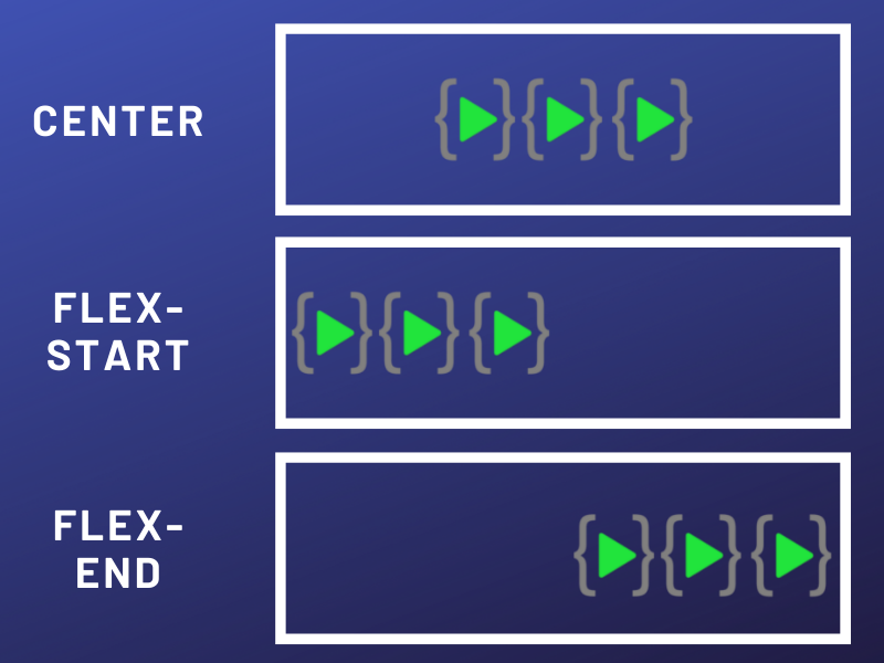
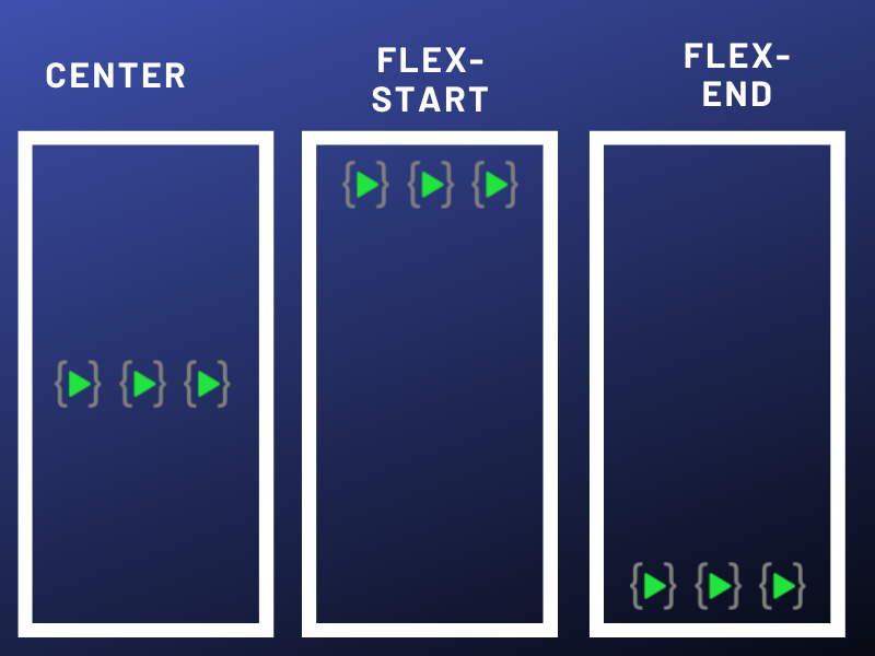
Justify-content
The justify-content property is used to align the flex items.
- center: The center value aligns the flex items at the center of the container.
- flex-start: The flex-start value aligns the flex items at the beginning of the container (this is default).
- flex-end: The flex-end value aligns the flex items at the end of the container.
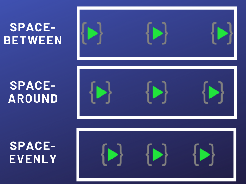
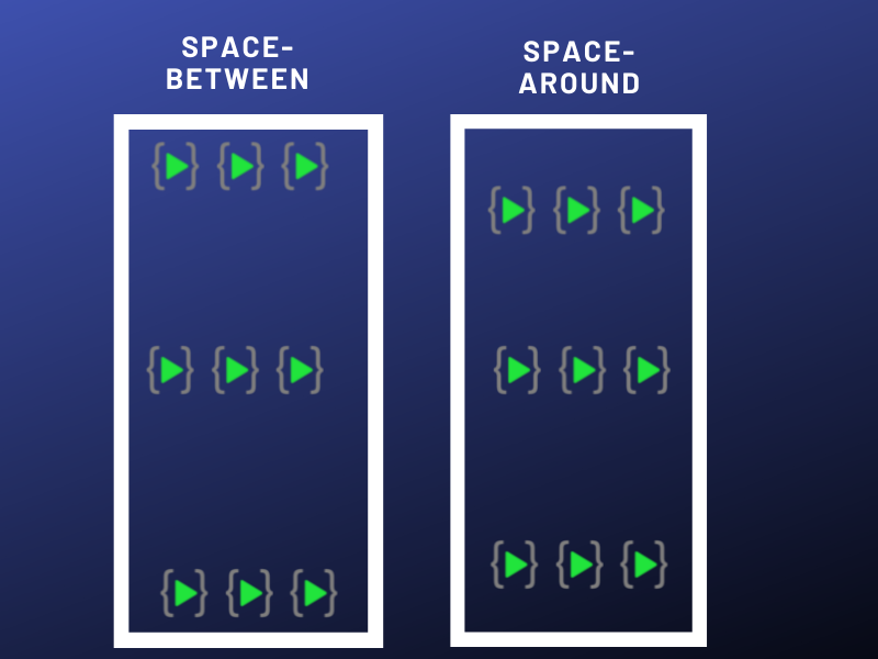
- space-around: The space-around value displays the flex items with space before, between, and after the lines:
- space-between:
The space-between value displays the flex items with space between the lines.
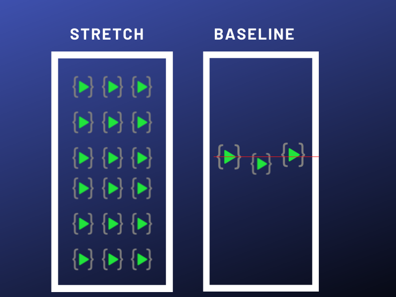
align-items
The align-items property is used to align the flex items.
- center: The center value aligns the flex items in the middle of the container.
- flex-start: The flex-start value aligns the flex items at the top of the container.
- flex-end: The flex-end value aligns the flex items at the bottom of the container.
- stretch: The stretch value stretches the flex items to fill the container (this is default).
- baseline: The baseline value aligns the flex items such as their baselines aligns.
align-content
- space-between: The space-between value displays the flex lines with equal space between them.
- space-around: The space-around value displays the flex lines with space before, between, and after them.
Order Property
The order property specifies the order of the flex items. The order value must be a number, default value is 0.
<div class="flex-container">
  <div style="order: 3">1</div>
  <div style="order: 2">2</div>
  <div style="order: 4">3</div>
</div>
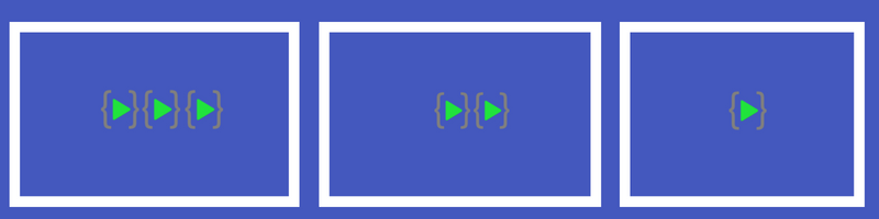
Flex-grow Property
The flex-grow property specifies how much a flex item will grow relative to the rest of the flex items.
<div class="flex-container">
  <div style="flex-grow: 1">1</div>
  <div style="flex-grow: 1">2</div>
  <div style="flex-grow: 8">3</div>
</div>

The flex-shrink Property
The flex-shrink property specifies how much a flex item will shrink relative to the rest of the flex items.
<div class="flex-container">
  <div>1</div>
  <div>2</div>
  <div style="flex-shrink: 0">3</div>
</div>